What the Blues taught me about Design

First of all—it has nothing to do with color.

Anyone who knows me knows I have a tendency to think (and express myself) in metaphors. This habit can alternately entertain and frustrate my family, friends, coworkers and random people I might talk to. But, I enjoy finding connections between topics that interest me and sometime draw valuable insights through them.

One thought that relates to my job as a creative manager and a guitar player is that sometimes a design problem is like a blues number. Hear me out: conventional wisdom holds that blues music is a very simple and relatively fixed genre. It follows a rigid format and commonly relies on a streamlined scale. Most people recognize the blues when they hear it—but still musicians are creating new blues tunes every day. I compare this with identity design.

In the case of a business system, the format has—over time—been pretty well determined. Typically a client needs a card, letterhead, envelope and a few collateral elements to communicate their brand (reason for being, values and so forth). More often than not, cost concerns come into play and limit the number of colors, paper choices and printing effects. If the brand has been around for a while, some elements like the color palette and fonts are already determined. Lastly, the resulting design has to be recognized for what it is—professional business paper. The idea of ‘reinventing’ the identity system (augmented-reality-laser etched-beer coaster-business cards anyone?) is as strange to me as a Phillip Glass sound composition on a Stevie Ray Vaughan album.

I have heard designers complain about constraints. But I have never heard modern blues players like Keb Mo’ fret about the pentatonic scale, or worry that Robert Johnson wrote a similar chord change in 1936. Maybe that’s modern players know that the tiny choices he or she makes can provide endless nuance and result in something entirely unique. The same is 100% is surely true for visual designers. Check out one of my favorite sites for identity design—lovelystationery.com for some stunning examples of well crafted business systems and brand collateral.

Good looking and clever.

Good looking and clever.


Sound Design Part 2

As a follow up to Sound Design Part 1, I am posting another entry about album cover design.

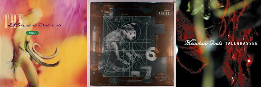
Soon after graduating from Miami University, I travelled to Europe for a couple of design workshops. One of which allowed me to spend a couple of weeks with the incredible Michael Twyman at the University of Reading in England. I used my proximity to London as an opportunity to visit 4AD—home to some of the most well-respected post-punk bands in music as well as iconic designer Vaughan Oliver. I'll save the story of our meeting for another post, but his work had a huge impact on album cover design in the 90’s. In some ways similar to Reid Miles’ professional arrangement with Blue Note Records, Vaughan Oliver worked on most of 4AD’s releases and as a result he gave the label and it’s artists their signature look—hyper-saturated color, endless layers of texture and beautifully anachronistic type treatments. (Anyone out there over 40 surely has some of his work a neglected CD folio.)

Covers for The Breeders, The Pixies, Mountain Goats

Covers for The Breeders, The Pixies, Mountain Goats

The studio visit was a highlight of my short time abroad. And the most amazing memory of that day was the realization that studio had only one computer—which wasn't even set up with design software. All of those memorable covers had composed with original photographs, a stat camera, rub-down type and mechanical boards!

Sound Design Part 1

A couple of weeks ago the creative group at my office got together for a little show-and tell. Before the meeting we were asked to bring in one or more of our favorite album covers. And the assortment was awesome. Who argue against the greatness of picks like Abbey Road or Sergeant Peppers; Back in Black; Andy Warhol’s cover for The Velvet Underground and Nico; Wish You Were Here, or the Beasties License to Ill—seriously, c’mon.

For my selections I chose a bunch of covers designed by Reid Miles for the Blue Note label. It’s true, I like jazz (it’s what I play). But more than that, I think Miles’ work quite simply defined what jazz music looks like. In addition the covers highlight what a graphic designer (as opposed to an artist, illustrator or professional photographer) can do. With relatively few tools, Miles focused on establishing a visual rhythm and creating compositional dynamics—tension and release. Over the course of his career he designed more than 400 covers for the biggest names in Jazz Music. 

A few of the Reid Miles’ covers for Blue Note.

A few of the Reid Miles’ covers for Blue Note.

I know many people are familiar with his work (there are coffee-table books dedicated to his covers), but if the name is new to you check out his wikipedia page or see his influence on other designers here.

For my next post, I will share what I didn't pick (but almost did). Hint: it isn’t Jazz.

There’s an axiom...

…that goes something like this: good design makes the complicated simple. I think every student designer has heard this at least a thousand times before completing Design Studio 101. And that's not a bad thing.

Today I came across a poster series titled philographics which illustrates this axiom perfectly. While the art director in me is dying to touch up the color palette and adjust the font sizes and kerning—I can't fault the concept at all.