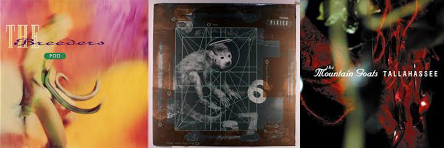
As a follow up to Sound Design Part 1, I am posting another entry about album cover design.
Soon after graduating from Miami University, I travelled to Europe for a couple of design workshops. One of which allowed me to spend a couple of weeks with the incredible Michael Twyman at the University of Reading in England. I used my proximity to London as an opportunity to visit 4AD—home to some of the most well-respected post-punk bands in music as well as iconic designer Vaughan Oliver. I'll save the story of our meeting for another post, but his work had a huge impact on album cover design in the 90’s. In some ways similar to Reid Miles’ professional arrangement with Blue Note Records, Vaughan Oliver worked on most of 4AD’s releases and as a result he gave the label and it’s artists their signature look—hyper-saturated color, endless layers of texture and beautifully anachronistic type treatments. (Anyone out there over 40 surely has some of his work a neglected CD folio.)
Covers for The Breeders, The Pixies, Mountain Goats
The studio visit was a highlight of my short time abroad. And the most amazing memory of that day was the realization that studio had only one computer—which wasn't even set up with design software. All of those memorable covers had composed with original photographs, a stat camera, rub-down type and mechanical boards!

